Elevating the user experience of a renowned fitness tracker app through a strategic.
Role
Industry
Duration
Users
👩🏽💻 Customers:
The users that wants to buy Herbalife’s products through the internet or explore more about the brand and the products’s content.
👨🏻💼 Distributors:
The Herbalife’s distributors that wants an easy digital platform to sell their products and prospect other clients to become distributors.
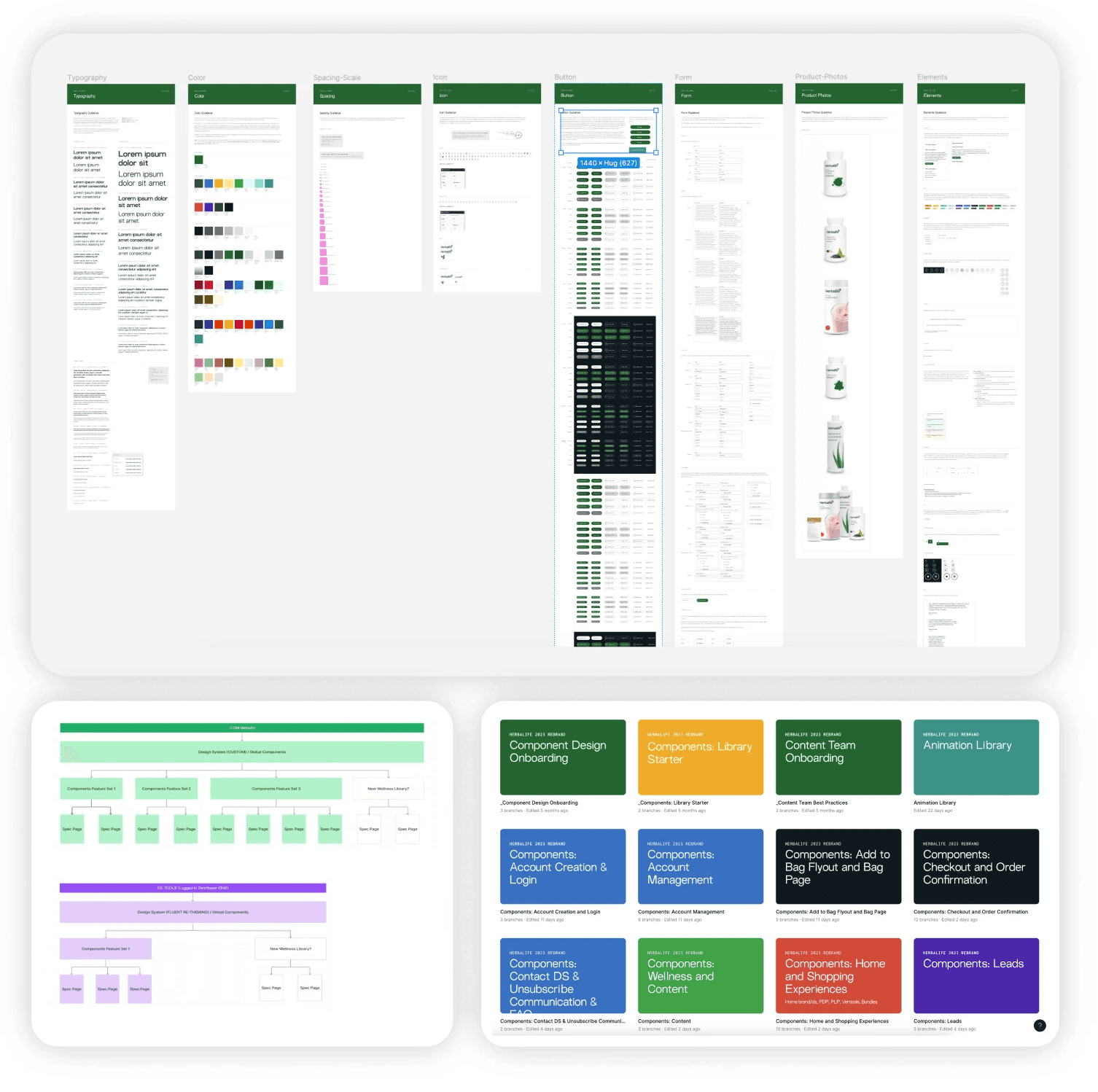
To create our design system that could expresses the brand and could be scalable ate the same time we follow these following design system principals:
Everything’s a component or style
Auto layout everything, all the way down
Make components resizable
Make component variants for functionality, design, and breakpoints.
Library Organization

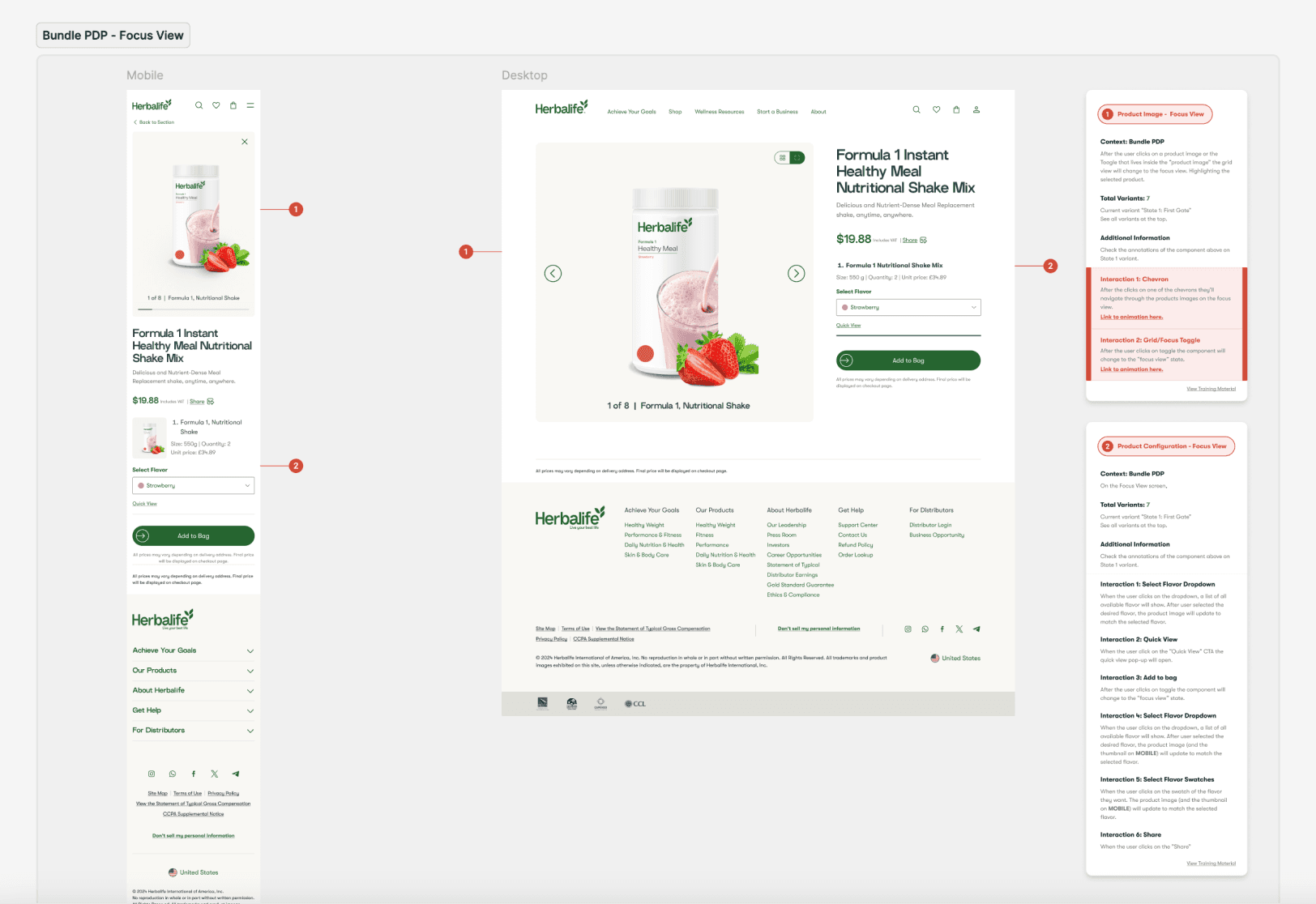
For the hand-off, we create a custom structure with detailed annotations of UX behavior, UI guidelines, and animation specs for each component and page.
High-fidelity Screens
In this section I will walk through the high-fidelity screens that I personally worked with and/or led the team on the design process.

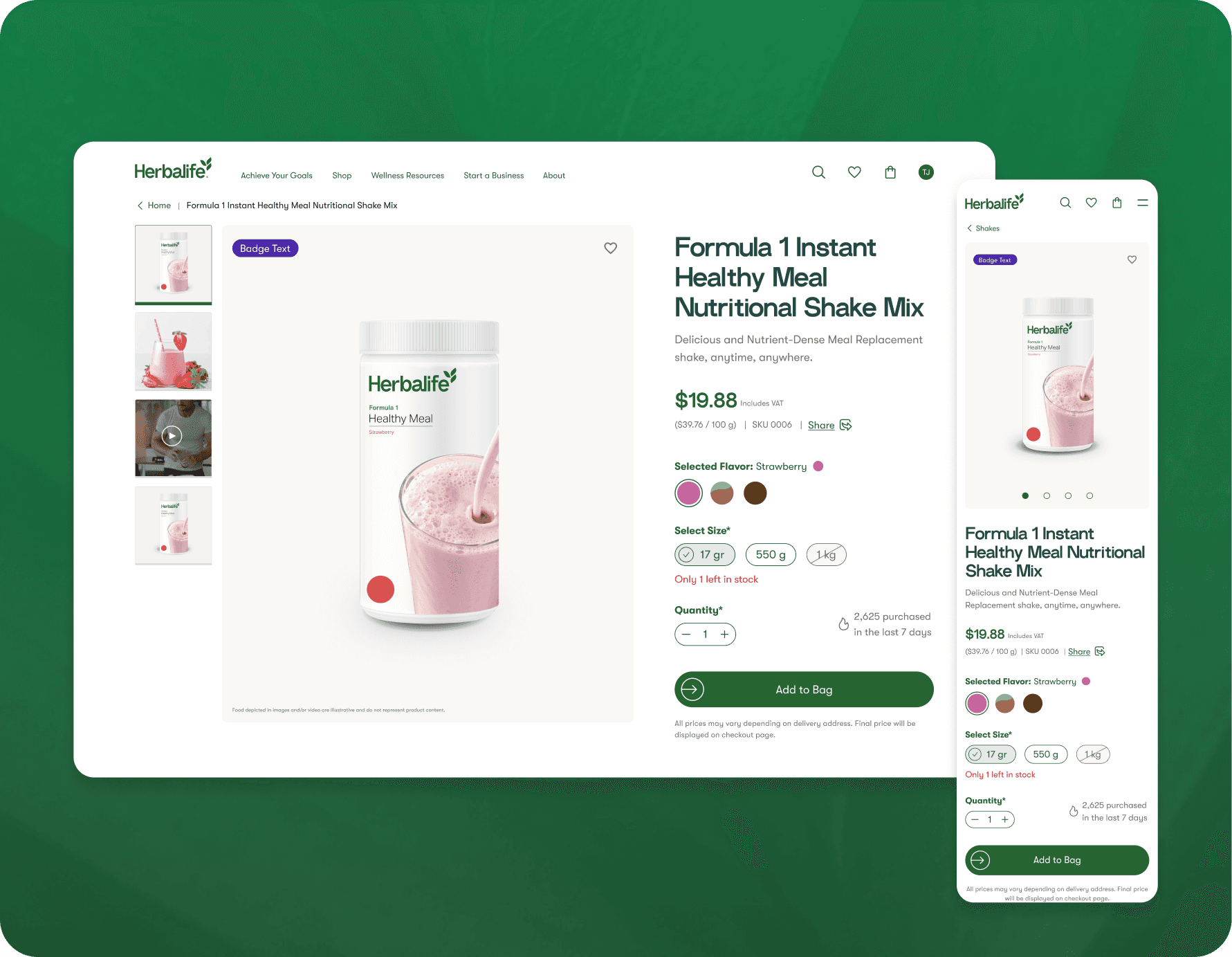
Product Detail Page
On the PDP, users can access all the information they need about the product and easily customize it. The UI was made to help the user to see in one viewport the most important stats at the same time, such as: Title, images, flavors, sizes, price and the “add to bag” CTA.
Product Detail Page - Bundles
On the bundles detail page, the user can quickly see all the products within the bundle and navigate them through the grid view and focus view.
With a dynamic interactions the user will always know which product they are editing.
Product Listing Page
The user can interact with the herbalife’s catolog through the product cards. With them is possible to compare the flavors, prices and sizes.
Product Listing Page - Bundles
The user can interact with the herbalife’s catolog through the product cards. With them is possible to compare the flavors, prices and sizes.

